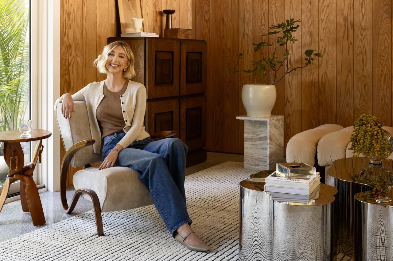
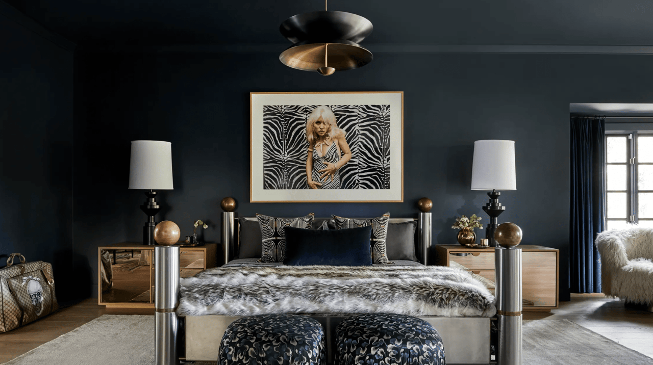
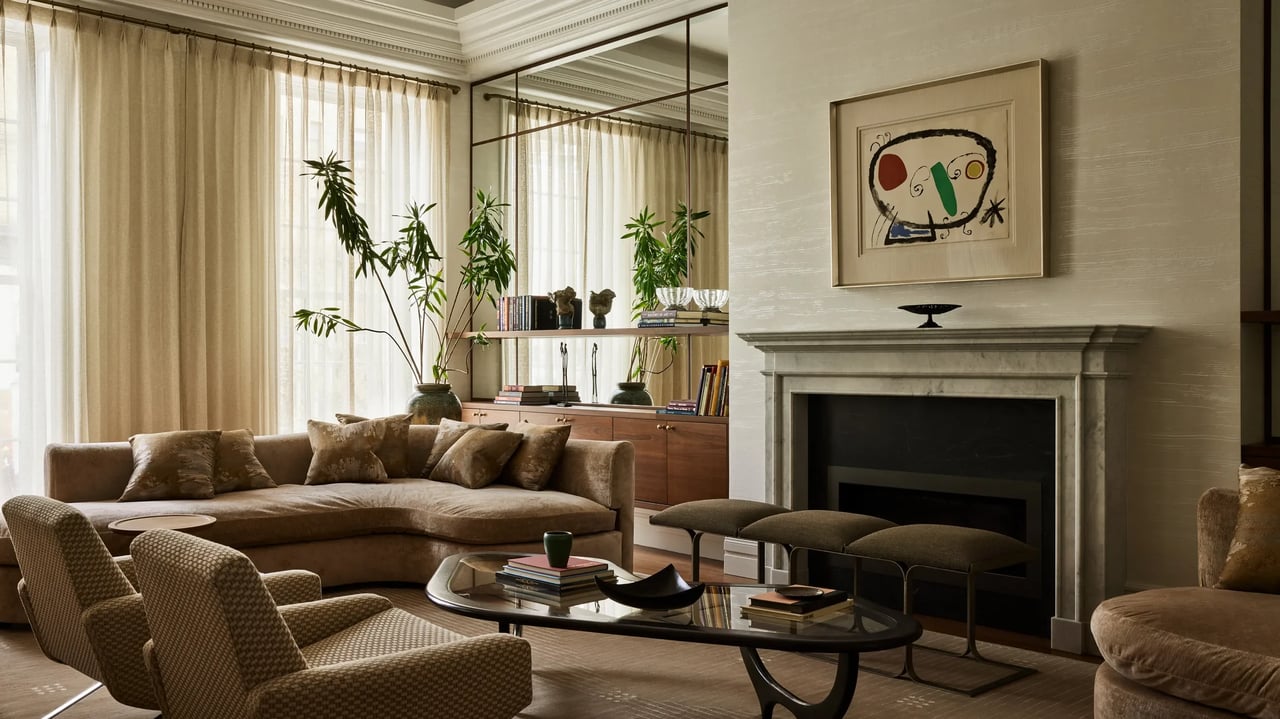
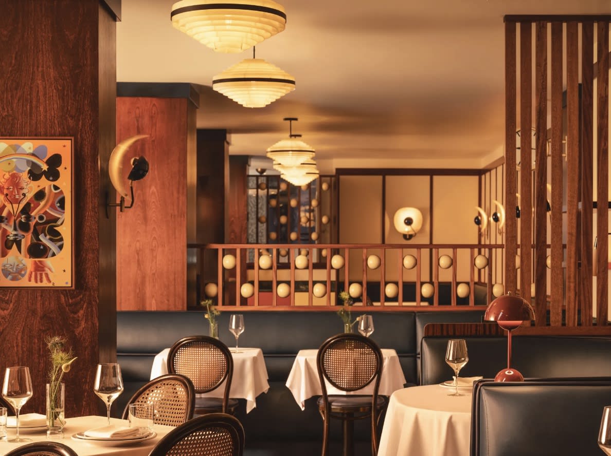
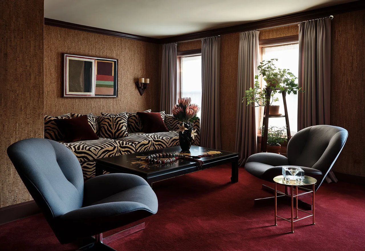
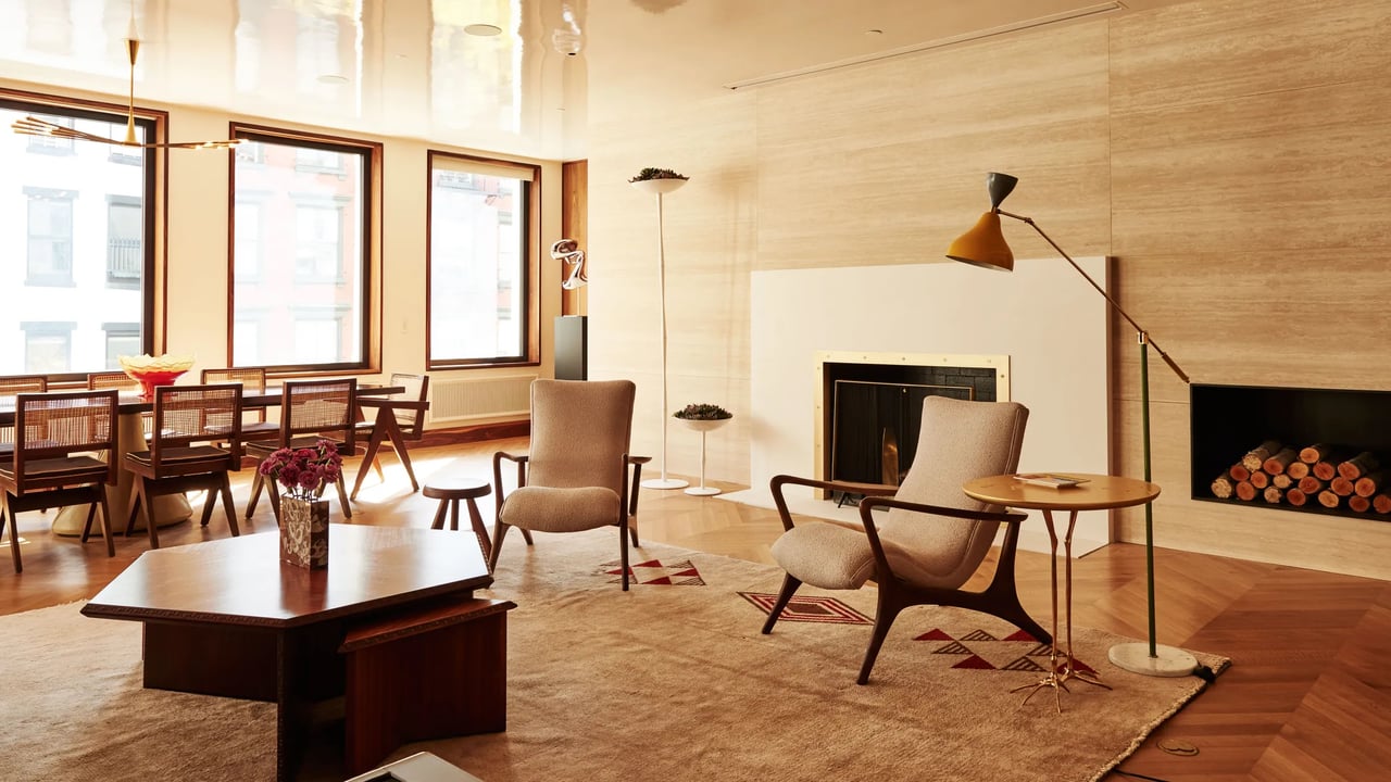
Ask interior designer Monique Gibson about her work, and she’s quick to explain that she sees herself as much more than someone who decorates homes. Based in New York but with projects around the country—and a slew of celebrity clients including Meg Ryan—Gibson has perfected the art of understanding people and anticipating what her clients want, frequently before they even know themselves. With this skill, she acts as a stylistic guide, shepherding homeowners gracefully through their projects and toward spaces that pay attention to sensation as much as aesthetics.
“Most clients are aware of what they believe to be beautiful,” Gibson says, “but the same clients aren’t always as certain about how a space makes them feel. I can look around a house with lots of color and pattern and think it’s beautiful, but it’s not necessarily what I would choose if I wanted it to feel restful. If your intended use for a space is to find rest, you must know what materials, colors, and shapes evoke a restful feeling for you.”
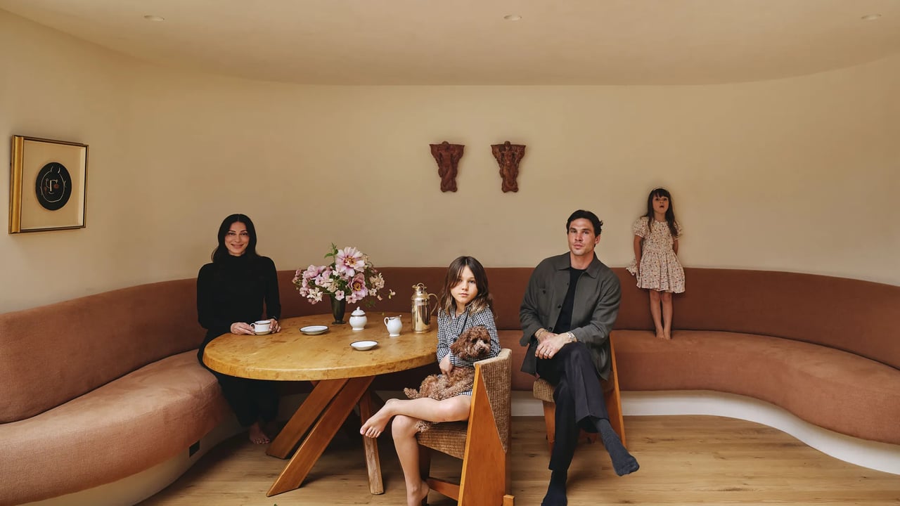
For one of Gibson’s recent clients—a couple building a weekend house on family land in New York—the ultimate objective for the project was creating a space to relax. With two demanding careers—and two children—they were looking for a home that would encourage them to unplug and spend time together as a family, connecting over shared meals, game nights, and lazy afternoons reading.
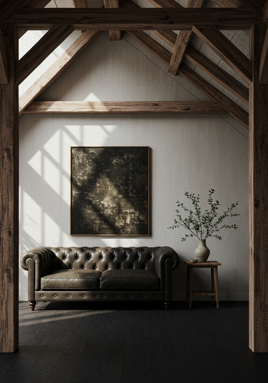
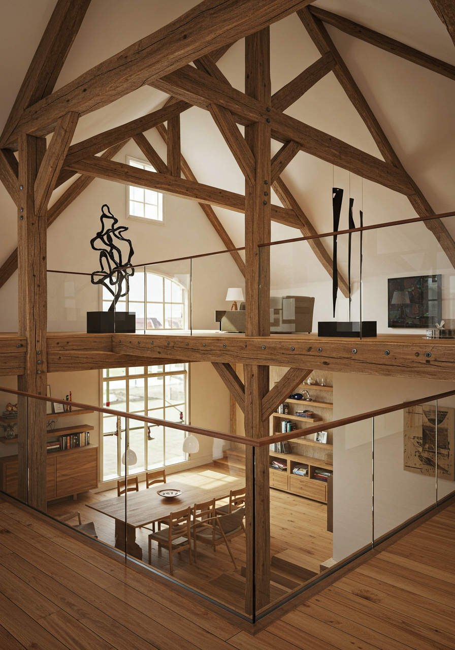
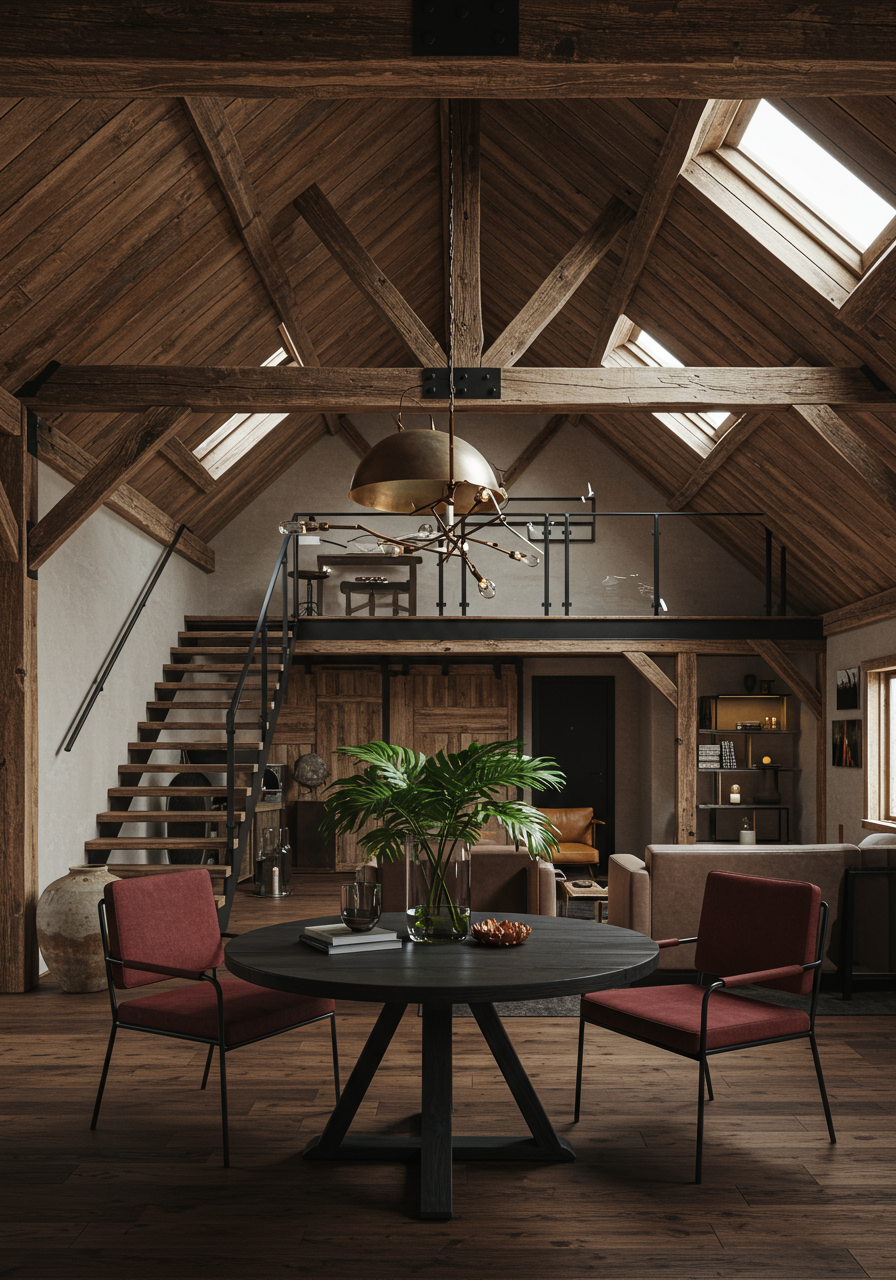
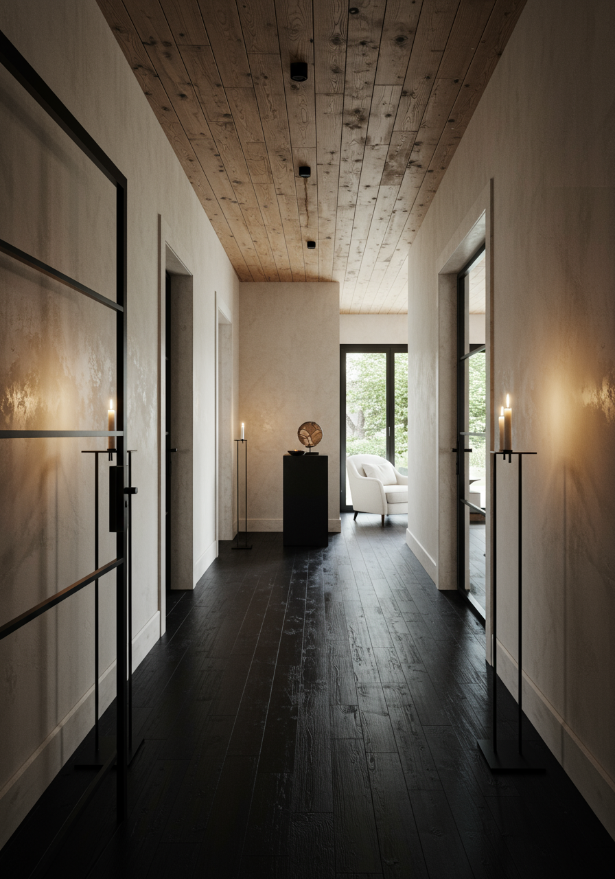
When the clients hired Gibson, the house, designed by architect Teo Siguenza, was already under construction. A modern structure, the residence embraces the local farmhouse style through materiality—reclaimed wood is seen prominently throughout—while contemporary details in glass and blackened steel pair with simple angles and a neutral palette for a sophisticated, updated appearance. “When I first saw the house, it looked like a new glass-and-metal structure had been built around an old wooden one,” Gibson says. “That purity and simplicity of order became our guiding principles.”
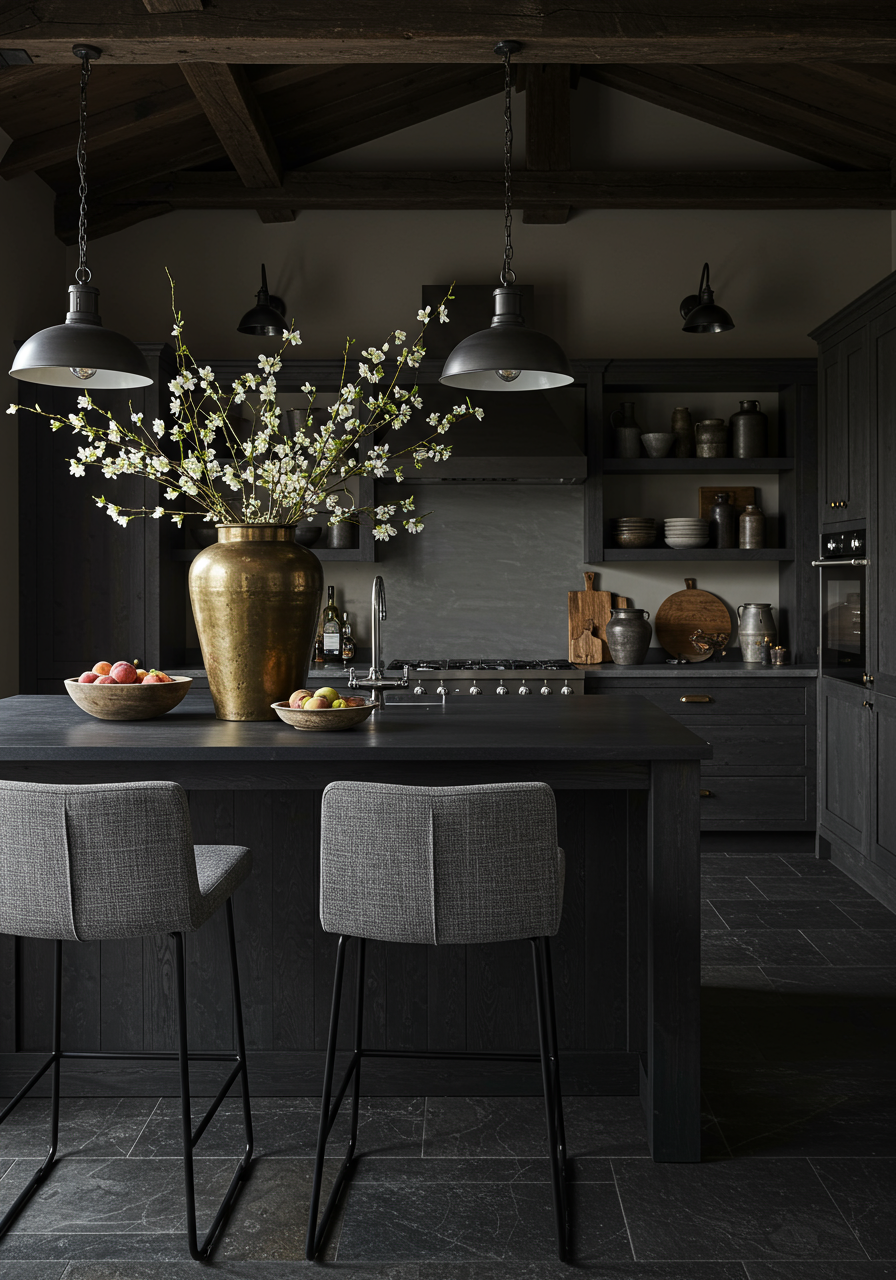
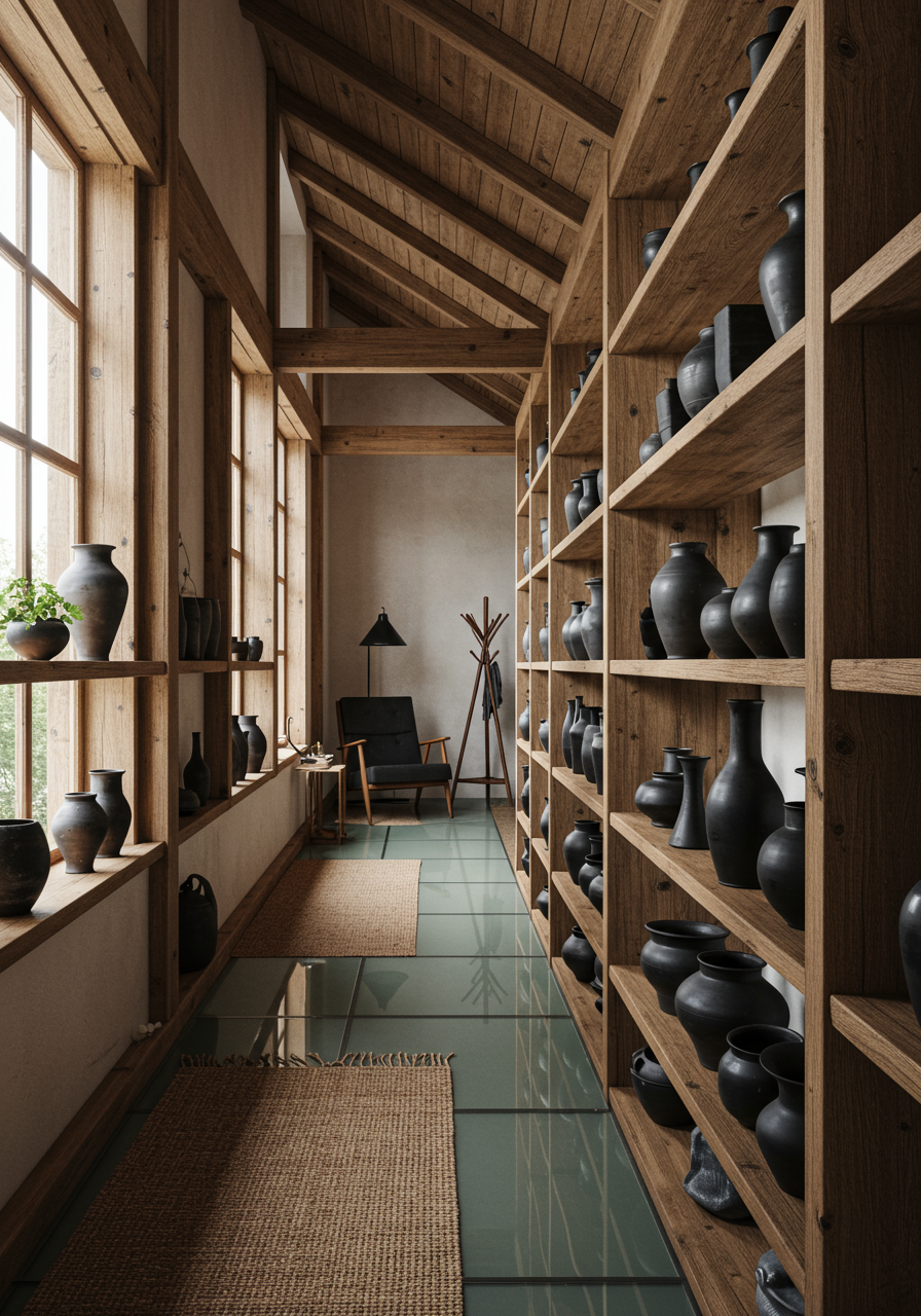
According to Gibson, the client found her after searching for pictures of black kitchens online featuring the designer’s home. “What was great about this client is that she knew herself,” Gibson says. “She knew that dark spaces were very comforting to her. One of the first things she said she wanted was a black kitchen.” To keep the room from feeling too severe, Gibson layered materials, starting with darkened, tumbled, and antiqued Belgian Blue Stone tiles for the floor. From there, she built up, using a striking custom steel island (crafted locally), burnt-oak cabinets (also made locally), and black Absolute Zimbabwe stone countertops. “One of the ways to create depth and interest within a limited palette is through textures,” Gibson explains. A set of handmade bar stools by Ayala Israel and collected ceramics displayed on open shelving help break up the monochrome scheme.
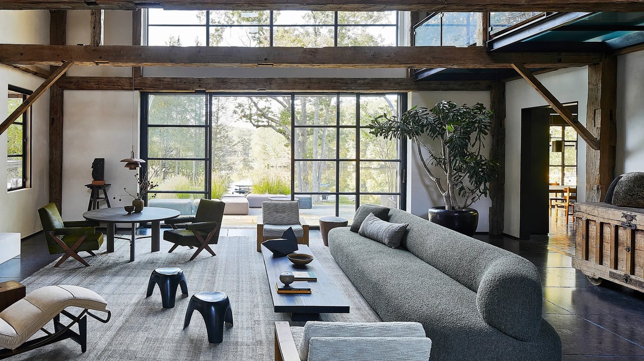
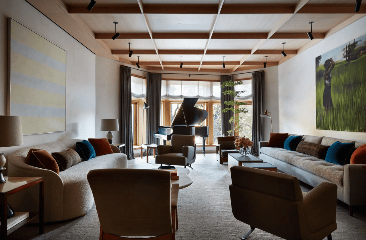
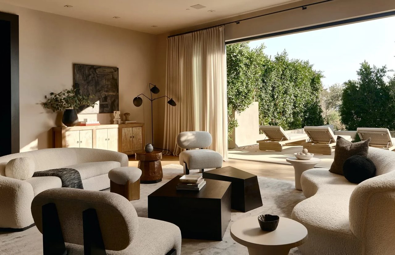
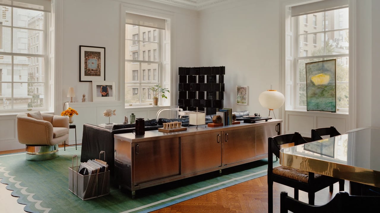
The rest of the two-level home’s ground floor holds additional public zones: the living and dining rooms (both enjoy scenic views of a bend in the river that runs through the property), a spacious entryway, two powder rooms, and a cozy family den. The living room, a favorite family gathering space, has soaring double-height ceilings and large sliding glass doors that open onto a patio that overlooks the river. A 14-foot sofa by Grant Trick provides plenty of room for guests. Smaller clusters of seating offer more intimate options, including a vintage chaise—once the property of Yves Saint Laurent—a favorite place to read for the client’s husband.
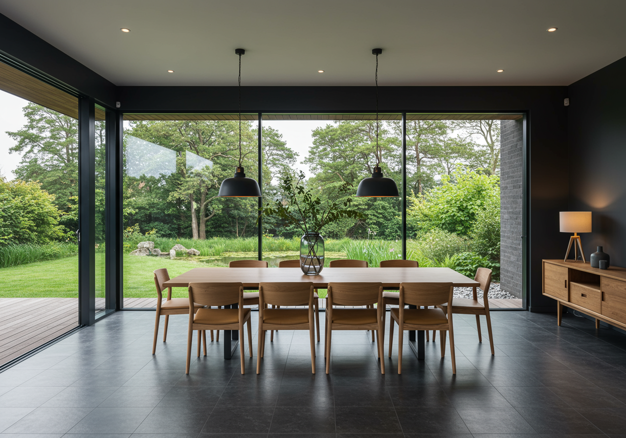
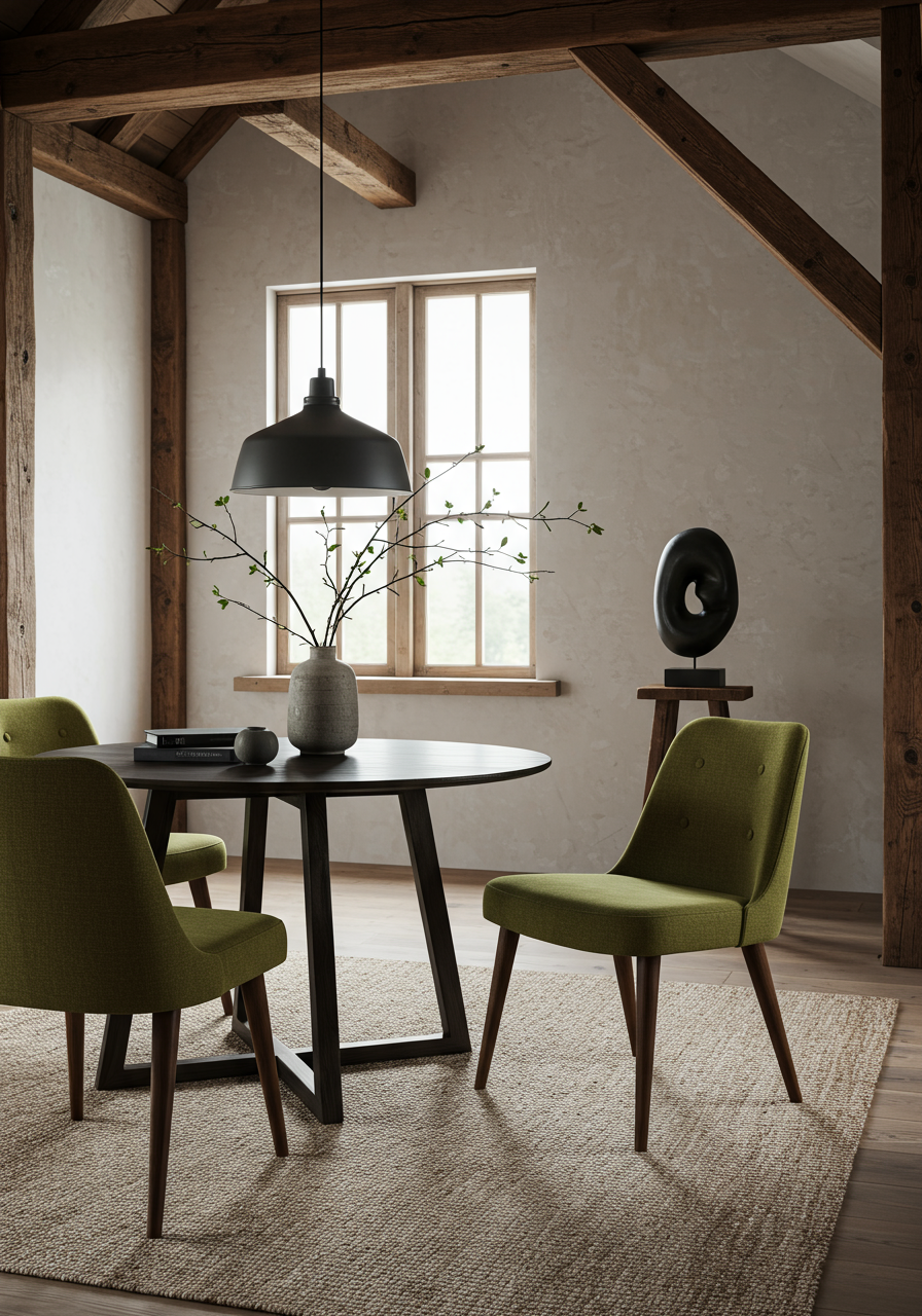
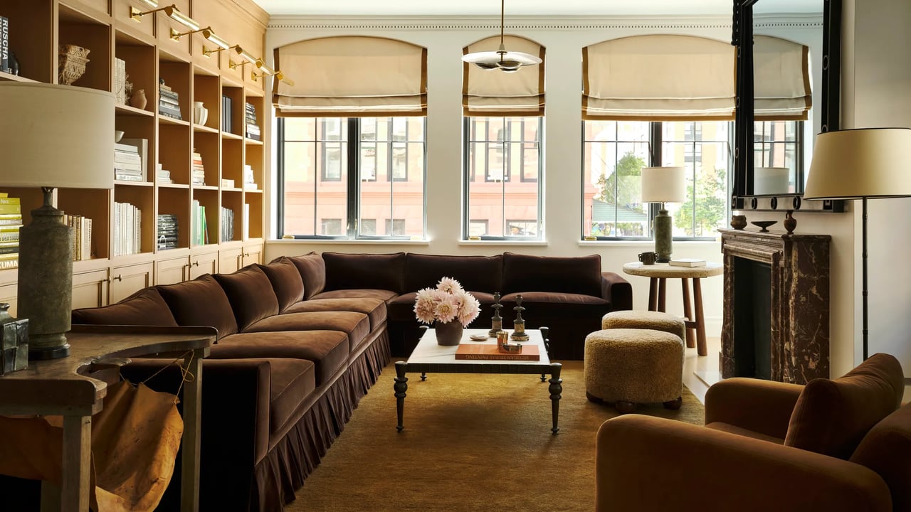
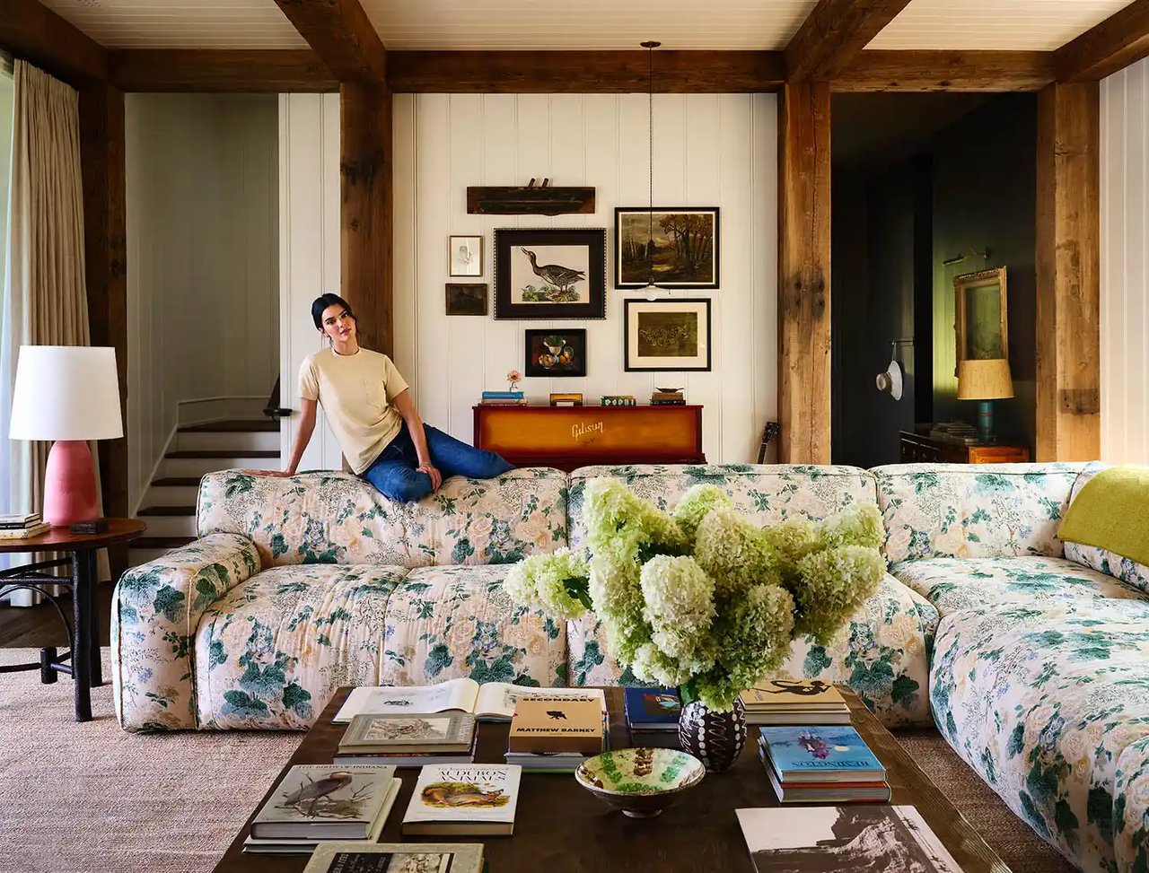
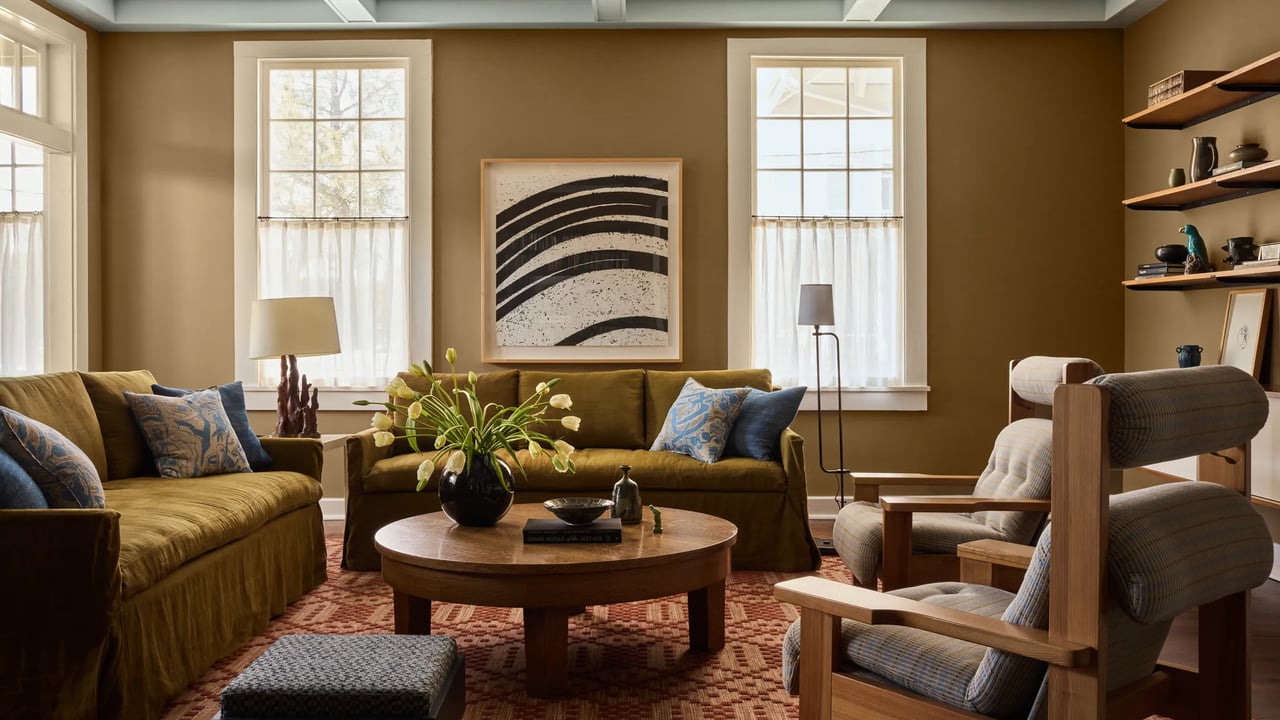
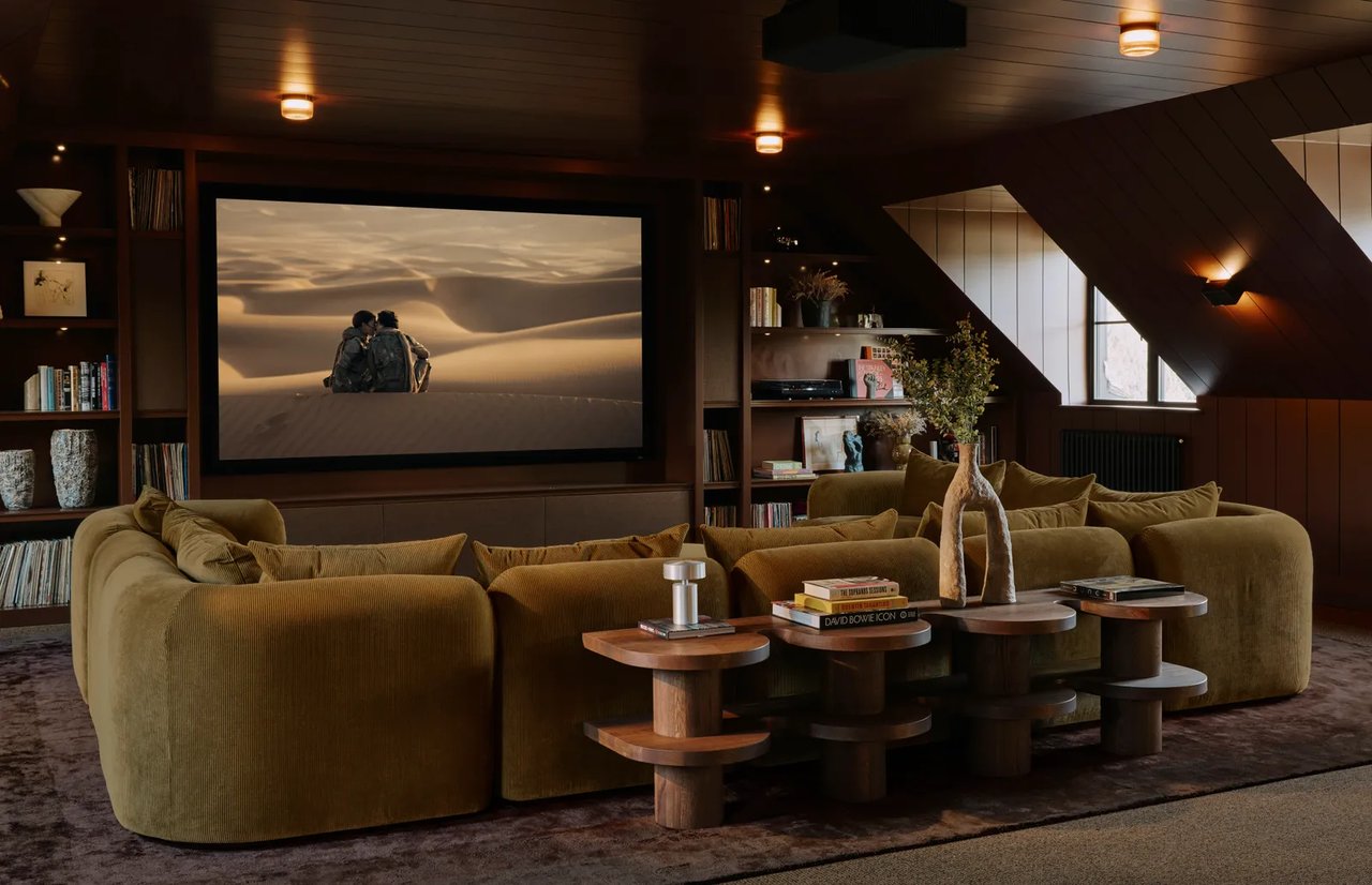
The dining room is adjacent to the kitchen, sharing the same Belgian Blue Stone flooring. For seating, Gibson chose a set of carved pine ladder-back chairs by late Swedish designer Axel Einar Hjorth. A custom Atomic Lamp by Atelier Van Lieshout hangs over a dark wood table with seating for 10. In the family room—the client’s favorite space in the home—a lowered ceiling, brown plastered walls, and a custom sectional create a cozy space to relax. In here and throughout the house, scrim curtains made from flax linen handwoven by Sam Kasten and fabricated by J.Edlin Interiors add soft texture and diffuse light. “This room is so tactile,” Gibson says, “you want to walk through and touch everything.”
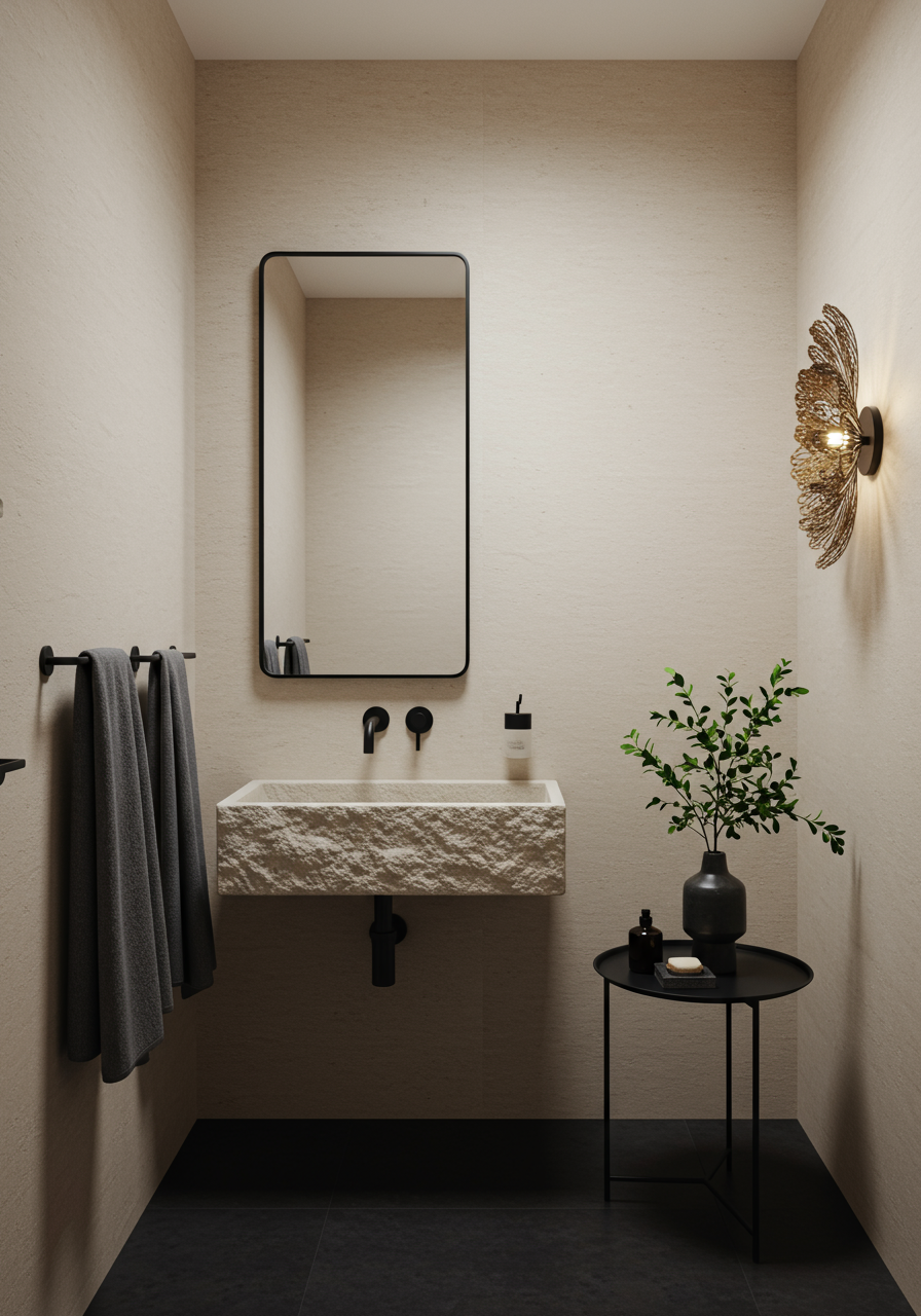
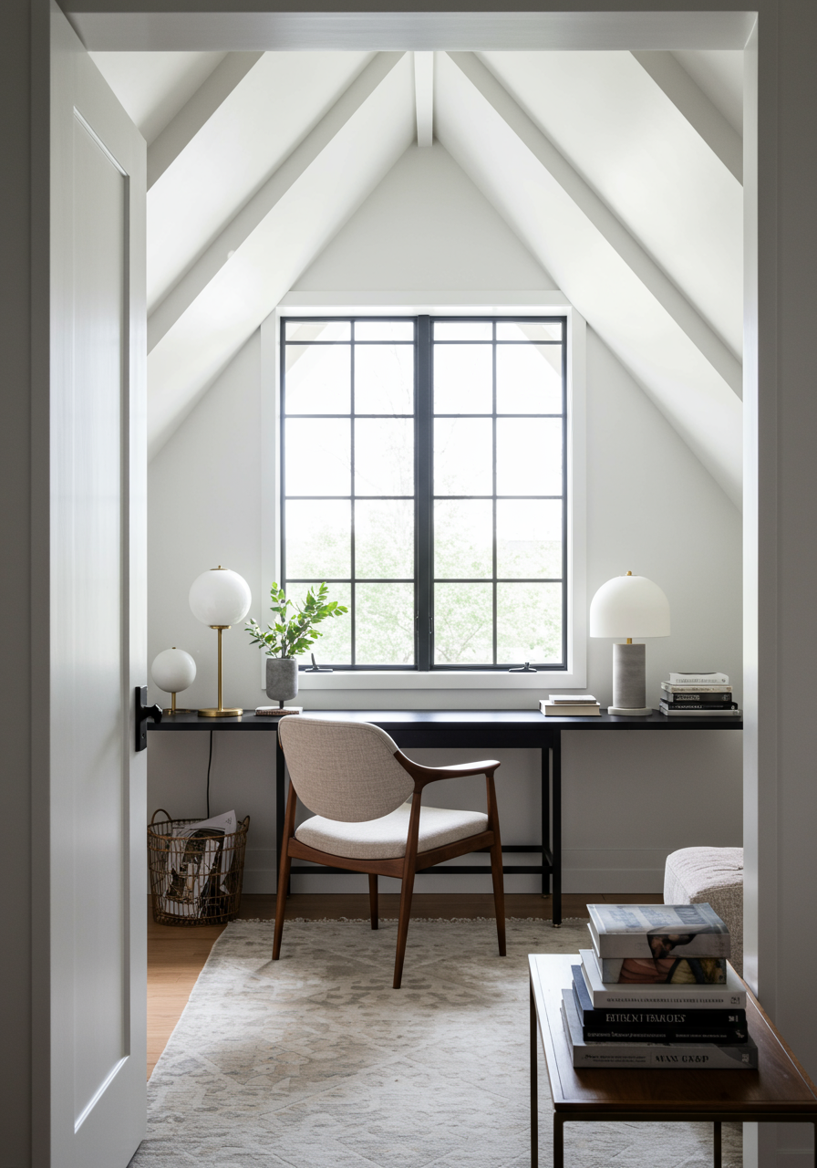
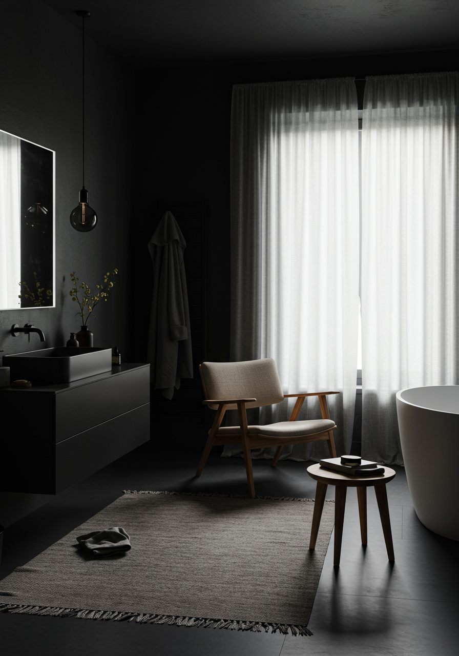
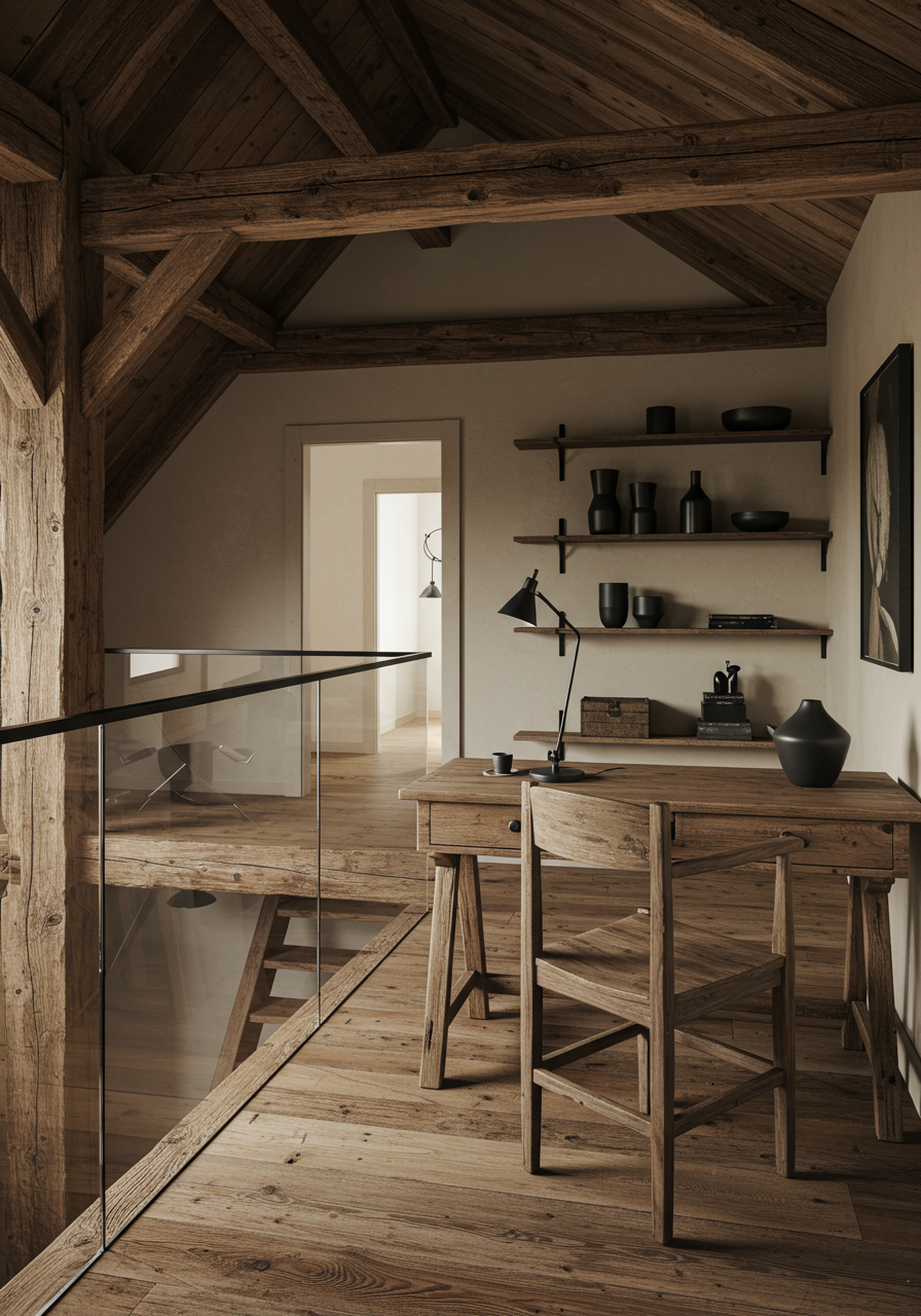
While the wife’s preferences drove much of the project, her husband is responsible for one of the most unique details in the home. “We were standing in the living room,” Gibson recalls, “and he looked up and said, ‘This is so much wasted space, couldn’t we build a catwalk with a bookcase where I can go up and read?’” A set of glass-and-steel stairs leads up to the resulting catwalk and the rest of the second floor, where bedrooms and offices allow the family space for alone time and, occasionally, work. The primary suite is both sumptuous and minimal, with gray textiles, a custom shou sugi ban headboard by Gustavo Neves, and a vintage Teli Pendant by Achille and Pier Giacomo Castiglioni for Flos. The wife’s bathroom is all black, with an eye-catching leathered Avocatus Stone appearing like green moss on the vanity wall. “When she first saw the stone, she said, ‘I don’t care how you use it, I have to have as much of it as you can get,’” Gibson says. A pair of wood chairs by Francis Jourdain, from 1924, round out the room.
This sense of pairing—contemporary and vintage, high-end designer and anonymous craftsperson, brightness and shadow—encapsulates the overall spirit of the project poetically, down to the input from the clients. As Gibson notes, “Both of them have their fingerprints clearly on this project.”
